微信小程序框架组件-组件基础内容
组件基础内容分类,如下图:

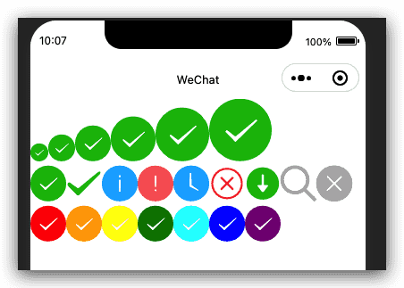
图标icon
基础库 1.0.0 开始支持,低版本需做兼容处理。
图标。组件属性的长度单位默认为px,2.4.0起支持传入单位(rpx/px)。
| 属性 | 类型 | 默认值 | 必填 | 说明 | 最低版本 |
|---|---|---|---|---|---|
| type | string | 是 | icon的类型,有效值:success, success_no_circle, info, warn, waiting, cancel, download, search, clear | 1.0.0 | |
| size | number/string | 23 | 否 | icon的大小 | 1.0.0 |
| color | string | 否 | icon的颜色,同css的color | 1.0.0 |
示例代码
1 | <view class="group"> |
1 | Page({ |
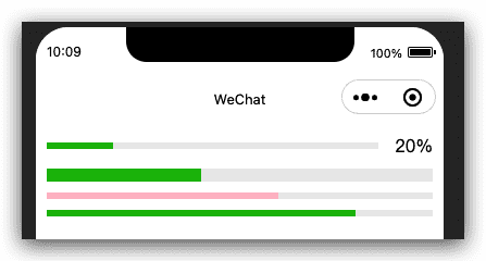
进度条progress
基础库 1.0.0 开始支持,低版本需做兼容处理。
进度条。组件属性的长度单位默认为px,2.4.0起支持传入单位(rpx/px)。
| 属性 | 类型 | 默认值 | 必填 | 说明 | 最低版本 |
|---|---|---|---|---|---|
| percent | number | 否 | 百分比0~100 | 1.0.0 | |
| show-info | boolean | false | 否 | 在进度条右侧显示百分比 | 1.0.0 |
| border-radius | number/string | 0 | 否 | 圆角大小 | 2.3.1 |
| font-size | number/string | 16 | 否 | 右侧百分比字体大小 | 2.3.1 |
| stroke-width | number/string | 6 | 否 | 进度条线的宽度 | 1.0.0 |
| color | string | #09BB07 | 否 | 进度条颜色(请使用activeColor) | 1.0.0 |
| activeColor | string | #09BB07 | 否 | 已选择的进度条的颜色 | 1.0.0 |
| backgroundColor | string | #EBEBEB | 否 | 未选择的进度条的颜色 | 1.0.0 |
| active | boolean | false | 否 | 进度条从左往右的动画 | 1.0.0 |
| active-mode | string | backwards | 否 | backwards: 动画从头播;forwards:动画从上次结束点接着播 | 1.7.0 |
| duration | number | 30 | 否 | 进度增加1%所需毫秒数 | 2.8.2 |
| bindactiveend | eventhandle | 否 | 动画完成事件 | 2.4.1 |
示例代码
1 | <progress percent="20" show-info /> |
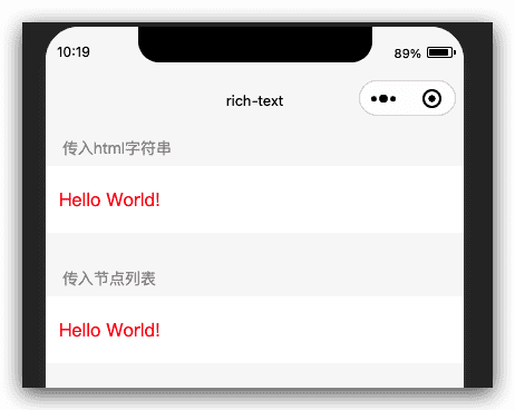
富文本rich-text
基础库 1.4.0 开始支持,低版本需做兼容处理。
富文本。
| 属性 | 类型 | 默认值 | 必填 | 说明 | 最低版本 |
|---|---|---|---|---|---|
| nodes | array/string | [] | 否 | 节点列表/HTML String | 1.4.0 |
| space | string | 否 | 显示连续空格 | 2.4.1 |
space 的合法值
| 值 | 说明 | 最低版本 |
|---|---|---|
| ensp | 中文字符空格一半大小 | |
| emsp | 中文字符空格大小 | |
| nbsp | 根据字体设置的空格大小 |
nodes
现支持两种节点,通过type来区分,分别是元素节点和文本节点,默认是元素节点,在富文本区域里显示的HTML节点
元素节点:type = node
| 属性 | 说明 | 类型 | 必填 | 备注 |
|---|---|---|---|---|
| name | 标签名 | string | 是 | 支持部分受信任的 HTML 节点 |
| attrs | 属性 | object | 否 | 支持部分受信任的属性,遵循 Pascal 命名法 |
| children | 子节点列表 | array | 否 | 结构和 nodes 一致 |
文本节点:type = text
| 属性 | 说明 | 类型 | 必填 | 备注 |
|---|---|---|---|---|
| text | 文本 | string | 是 | 支持entities |
受信任的HTML节点及属性
全局支持class和style属性,不支持id属性。
| 节点 | 属性 |
|---|---|
| a | |
| abbr | |
| address | |
| article | |
| aside | |
| b | |
| bdi | |
| bdo | dir |
| big | |
| blockquote | |
| br | |
| caption | |
| center | |
| cite | |
| code | |
| col | span,width |
| colgroup | span,width |
| dd | |
| del | |
| div | |
| dl | |
| dt | |
| em | |
| fieldset | |
| font | |
| footer | |
| h1 | |
| h2 | |
| h3 | |
| h4 | |
| h5 | |
| h6 | |
| header | |
| hr | |
| i | |
| img | alt,src,height,width |
| ins | |
| label | |
| legend | |
| li | |
| mark | |
| nav | |
| ol | start,type |
| p | |
| pre | |
| q | |
| rt | |
| ruby | |
| s | |
| section | |
| small | |
| span | |
| strong | |
| sub | |
| sup | |
| table | width |
| tbody | |
| td | colspan,height,rowspan,width |
| tfoot | |
| th | colspan,height,rowspan,width |
| thead | |
| tr | colspan,height,rowspan,width |
| tt | |
| u | |
| ul |
Bug & Tip
tip: nodes 不推荐使用 String 类型,性能会有所下降。tip:rich-text组件内屏蔽所有节点的事件。tip: attrs 属性不支持 id ,支持 class 。tip: name 属性大小写不敏感。tip: 如果使用了不受信任的HTML节点,该节点及其所有子节点将会被移除。tip: img 标签仅支持网络图片。tip: 如果在自定义组件中使用rich-text组件,那么仅自定义组件的 wxss 样式对rich-text中的 class 生效。
示例代码
1 | <view class="page-body"> |
1 | Page({ |
文本text
基础库 1.0.0 开始支持,低版本需做兼容处理。
文本。
| 属性 | 类型 | 默认值 | 必填 | 说明 | 最低版本 |
|---|---|---|---|---|---|
| selectable | boolean | false | 否 | 文本是否可选 (已废弃) | 1.1.0 |
| user-select | boolean | false | 否 | 文本是否可选,该属性会使文本节点显示为 inline-block | 2.12.1 |
| space | string | 否 | 显示连续空格 | 1.4.0 | |
| decode | boolean | false | 否 | 是否解码 | 1.4.0 |
space 的合法值
| 值 | 说明 | 最低版本 |
|---|---|---|
| ensp | 中文字符空格一半大小 | |
| emsp | 中文字符空格大小 | |
| nbsp | 根据字体设置的空格大小 |
Bug & Tip
tip: decode可以解析的有<>&'tip: 各个操作系统的空格标准并不一致。tip:text 组件内只支持 text 嵌套。tip: 除了文本节点以外的其他节点都无法长按选中。bug: 基础库版本低于2.1.0时, text 组件内嵌的 text style 设置可能不会生效。
示例代码
1 | <view class="btn-area"> |
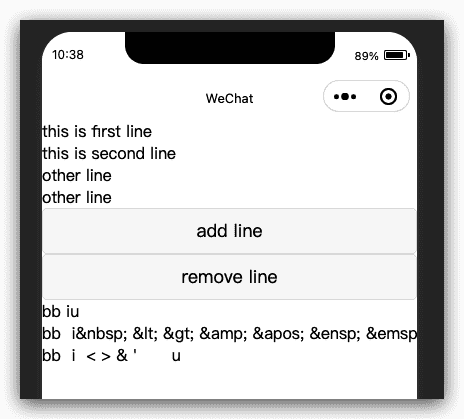
1 | var initData = 'this is first line\nthis is second line' |
微信小程序框架组件-组件基础内容